Visualization of a high-range data with pseudo logarithm
One of the common problems for data presentation is how to deal with the data with a very high range when it is important to show details at the high and low values. For example, we can have a very strong source of oscillations with relatively weak waves excited by this source and we need to display both of them on the same plot. The solution of this problem is shown in the video about wide-ranged data.
Rescaling methods
Framework for experiments
For clarity, let's generate this situation numerically.
import numpy as np
import matplotlib.pyplot as plt
def sigmoid(x):
    s = 1-1 / (1 + np.exp(-5*x))
    s *= 1000000
    s += 1
    return s

def func(x):
    f = 5*np.cos(x)*np.sin(x+np.pi/4) * sigmoid(x) - 3
    return f
x = np.linspace(-10, 10, 1000)
y = func(x)
In this code, I use a very high-ranged sigmoid function multiplied by a simple oscillation function. Also, I do make sure that for any values of X, this function oscillated around the horizontal axis, i.e. has positive and negative values. I will show a few different ways of rescaling and plot them on the same big graph. For this, I will use this subplot framework:
fig, axs = plt.subplots(3, 3, figsize=(11, 7))
# plots are here...

plt.tight_layout()
plt.show()
Original graph
With this framework, we can plot the original function without any modifications. Also, let's print the range of this function.
print(f"max={y.max()}; min={y.min()}")
max=4267689.260303051; min=-732163.6227984702
axs[0,0].plot(x, y)
axs[0,0].grid(True)
axs[0,0].set_title('Original')
The range of this function for low X is in order of millions and for the high X, the range of this function is within only tens.
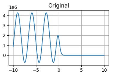
The graph of the function without any scaling. As it was predicted - it is impossible to see the behaviour of this function for X > 2.5.
There are a few ways to rescale these data to have a better presentation in all ranges of values, let's explore them in detail.
Limits
The first obvious solution is to apply limits to omit detailed information at the large values but resolve the low-value range.
axs[0,1].plot(x, y)
axs[0,1].set_ylim(-10, 10)
axs[0,1].grid(True)
axs[0,1].set_title('with limits')
In this code, we limit the range of plotted values by the range from -10 to 10.
![Limited plot without rescaling The graph of the function without any scaling with limited in the range [-10, 10].](/images/0/0/C/2/194_limited_graph.jpg)
The graph of the function without any scaling with limited in the range [-10, 10].
As for now, it is possible to see the details at the low range of the function, but it is pretty difficult to see anything at the big range. For some analysis, it is ok, when you do not need to plot overloaded data. For some data, it is not acceptable.
To resolve this problem we can try to use the logarithmic scale:
Logarithm scale
Logarithm scale is a popular way to display data with exponential growth, or as in our case with a very wide range. For the simplicity of quantitative analysis, it is very common to take a logarithm with a base of 10.
The first possible problem for the logarithm, it is only defined for positive arguments. It is easy to resolve by calculating the logarithm for positive values and then taking the logarithm from the module of the negative argument and changing the sign of the result.
In Python, it is very convenient to do with applying positive and negative masks in Numpy
# log10
positive_mask = y > 0
negative_mask = y < 0
Ylog10 = np.zeros_like(y) # Ylog10 = y*0 is also acceptable

Ylog10[positive_mask] = np.log10(y[positive_mask])
Ylog10[negative_mask] = -np.log10(-y[negative_mask])

axs[0,2].plot(x,Ylog10)
axs[0,2].grid(True)
axs[0,2].set_title('log10')
This code for the values of the y > 0 makes a positive mask (y - is a numpy array of results) and for y < 0 - makes a negative mask. Then for the modified values, we create an array of the same size as our values filled with 0, by simple multiplication, or using numpy function zeros_like().
Then we apply the logarithm with the base 10 to positive values and apply the logarithm with base 10 to a negative parameter for negative parameters and then change its sign.
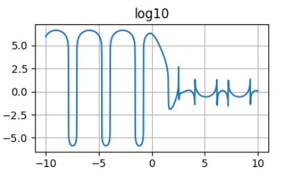
The graph of the function with logarithmic scale.
This plot is better. First of all, it shows the behaviour of the function at the low and high values. Also, it is possible to estimate real values as powers of the 10. But it has strange peaks around the places where the function is crossing the y=0 line. This is becasue the the value of the logarithm for the parameters below 1 is negative and approaching \(-\infty\). That is why this method of scaling is not very practical for the function with positive and negative values.
But we can resolve it by adding 1 to the parameter of the logarithm scaling function.
log1p scaling
Numpy function log1p() returns the natural logarithm of one plus the input array, element-wise. You can also use log(y+1) way of calculating. It will be the same, but using the proper function will make calculations perform much faster. Again we need to split values into a positive and negative range. Also, it is important to remember, that log1p() is a natural logarithm, and to convert it to a decimal logarithm, it is necessary to divide the results into a log(10).
# log10 + 1 (log1p)
Ylog11 = y*0

Ylog11[positive_mask] = np.log1p(y[positive_mask])/np.log(10)
Ylog11[negative_mask] = -np.log1p(-y[negative_mask])/np.log(10)

axs[1,0].plot(x,Ylog11)
axs[1,0].grid(True)
axs[1,0].set_title('log10+1')
It is not necessary to calculate positive and negative masks again, we already calculate it.
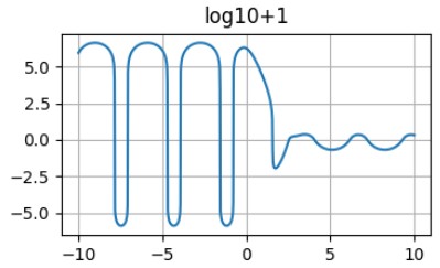
The graph of the function with logarithm+1 scaling.
This is a perfect plot for a wide range of values. Another good way of representing this kind of data is a pseudo-logarithm.
Pseudo logarithm.
It is possible to design logarithm-like functions, which is an odd function, approach to log(x) at the large values of X, and approximately linear at the low X values.
\[y = \frac{arsinh(\frac{x}{2})}{\ln(10)}\]
This function at close the the logarithm+1 function:
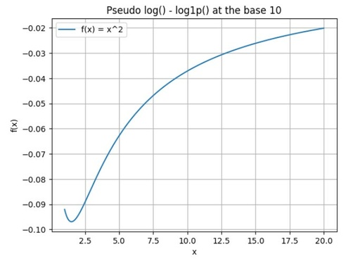
The Difference between pseudo-logarithm and logarithm + 1 functions at low values of X.
Original image: 683 x 495
It is possible to see, that these functions are pretty similar and any of them can be used.
def pseudo_log(x):
    return np.arcsinh(x / 2) / np.log(10)
# Pseudo log
Yplog=pseudo_log(y)

axs[1,1].plot(x, Yplog)
axs[1,1].grid(True)
axs[1,1].set_title('Pseudo log')
The advantage of the pseudo-logarithm function - it is defined for all ranges of parameters and it is not necessary to split them into positive and negative sets.
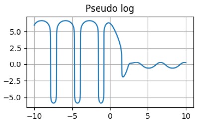
The graph of the function with pseudo-logarith scaling.
Apart from this advantage, they are very similar and give some problems in the exact definition of the small-by-module parameters.
High power root scaling
Another, way to rescale large range data for displaying is the root of a high power. For odd power, it is not necessary (in theory) to split parameters into positive and negative subsets. Rather than for even powers of the root, the behaviour of the graph is very complicated. You can watch the video about how to calculate roots from negative values.
Unfortunately, python is not very good at calculating the power of (1/odd integer) from negative values, therefore it is necessary to split the dataset into positive and negative subsets.
# root 10
Yr=y*0
Yr[positive_mask] = y[positive_mask]**(1/10)
Yr[negative_mask] = -(-y[negative_mask])**(1/10)

axs[1,2].plot(x, Yr)
axs[1,2].grid(True)
axs[1,2].set_title('root 10')
The result looks promising, but again it is difficult to clearly understand the relation between real and displayed values. Also, this scaling increases the values in the absolute range lower than 1, which allows us to observe really small features.
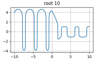
The graph of the function with root of power 10 scaling.
This function is also can be used for the scaling of the wide-ranged function.
Combined scaling
Another prominent way of presenting data is to use different scaling procedures for different data ranges. Ideally, when at the border between different scale ranges the scaled values are equal, but sometimes it is impossible to achieve for standard scaling procedures. In this case, it is necessary to mention the jumps on the graph or use the gap between ranges to make the graph smooth.
For example, we can take real values within the range [-5, 5] and take pseudo-logarithms outside this range.
# combined
big = (y > 5) | (y < -5)
small = (y <= 5) & (y >= -5)
Yc=y*0

Yc[big] = pseudo_log(y[big])
Yc[small] = y[small]

axs[2,0].plot(x, Yc)
axs[2,0].grid(True)
axs[2,0].set_title('combined')
It is easy to make maks in numpy for any conditions but adding logic operations.
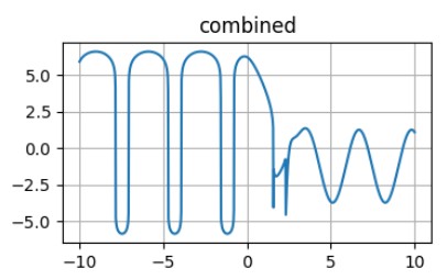
The combination of a linear and pseudo-logarithmic scale without a gap.
As one can see, without the gap, the graph has some strong jumps when changing from one scaling to another and the only way to avoid them is to omit some data in the switching area.
For every particular task, it is necessary to choose the best way of scaling to show the most desired parts of the graph.
2D example
The same principle is much better to show on the 2D plot, which can be done with imshow procedure from the matplotlib. I will not show the codes, required for this plot, but only show the comparison of a few different approaches to the same data.
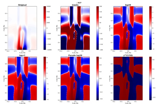
Examples of a different methods of a 2D scaling for representing wide range data.
Original image: 5400 x 3600
As one can see from the above image, the different scaling methods can give slightly different results and the way of scaling should be chosen based on the task required to be solved and the features that need to be shown on the plot.
Published: 2024-07-20 10:58:14
Updated: 2024-07-20 11:51:44